Moonza JournalDezeen — Interiors2 min read
A Seaside Penthouse Draws Its Palette From the North Sea Shore
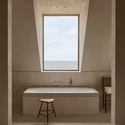
Antwerp-based Merckx-Holvoet Architecten designed V Penthouse, a holiday home on the ninth and tenth floors of a building in Duinbergen, with interiors informed by the sandy tones of Belgium’s North Sea coast.
The Moonza view
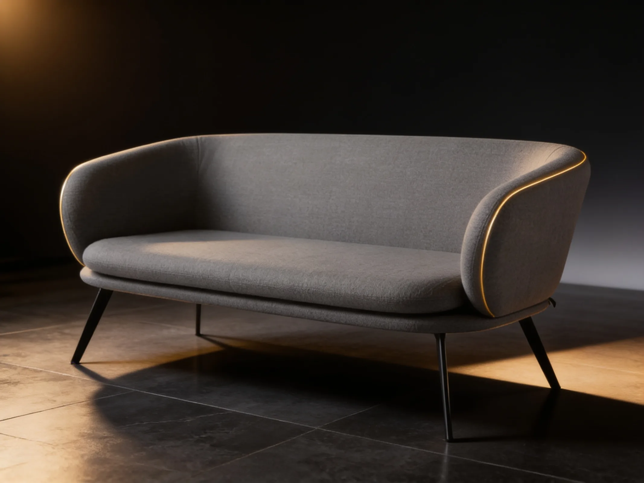
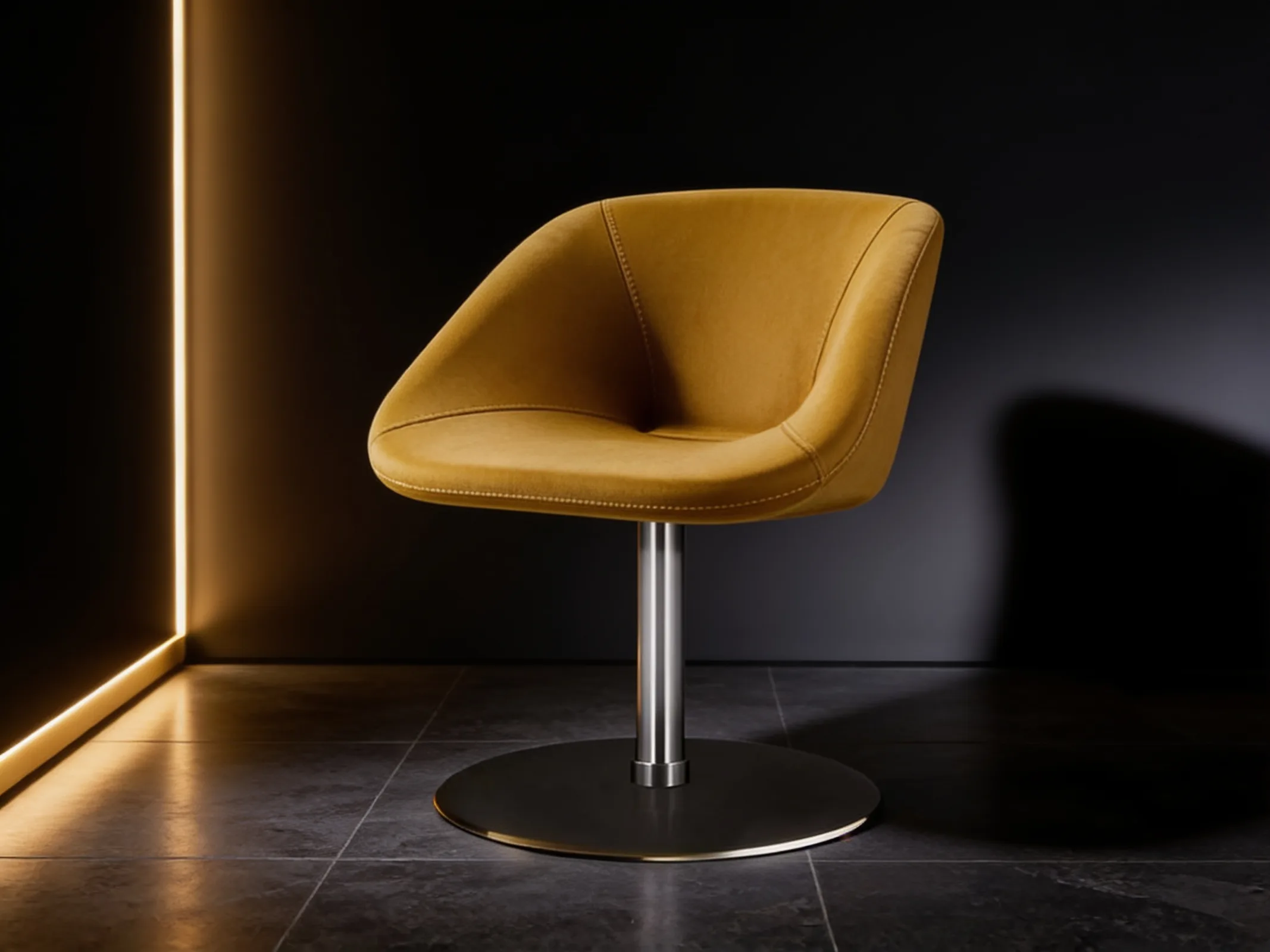
Taking cues from the view outside is the simplest way to build a coherent colour palette. Sandy tones, beige and warm greys bring calm and look good in any light, which is why they are popular in hotels, lobbies and luxury offices.
A neutral palette lets textures shine: linen on sofas, light timber on tables, matt stone on floors. If everything is one colour, create variety with texture rather than colour. The approach suits reception areas and meeting rooms that should feel calm and neutral.
- Take your palette from the landscape or surroundings of the building
- In a neutral scheme, create variety with fabric and timber textures
- Sandy tones bring calm to reception areas and meeting rooms